30 August 2015

ILLUSTRATION PROJECT: Illustrated Watercolor Alphabet

Time for another Illustration Project post here on my art blog!


The newest illustration project I've finished is this alphabet for children, painted in watercolors.

It consisted of both a color and a black and white version of each letter of the alphabet, and was generally a lot of work (relaxing work, but anyway...)

It's to be used in a school setting to be colored in and to form words, respectively.

As always, I like the 'handmade' look of my work, so I decided against using an existing font as a base for the letters, and instead started with constructing the individual letters from scratch.

Then I sketched in the animals and objects starting with the letter in question.

CUE UGLY SKETCHES!


... it could only go upwards from there.

Some letters were easy to do, providing a variety of cute and easily recognizable objects to be filled with.

Some were ridiculously hard to fill, though. Words with Q, anyone? How to draw a 'Quilt' in black and white? Will any child even know what a 'Zither' is?

That up there in the right corner is one.

Painting the individual letters of the alphabet:

The quilt made it due to Q not offering all that much else.
The queen is one of my overall favorites, though!
Anyway, indecision and sketching woes passed by, and I went on to color all 26 drawings.

I left the pencil line art visible to provide some contrast and started layering watercolors. Every letter of the alphabet has a slightly different background color forming an overall 'rainbow' gradation effect if all the letters are placed in order of the alphabet next to each other. The colors of the objects and animals inside were adjusted to look harmonious within that base color.

'O' is slightly more greenish in its background color...

... than the following letter 'P'.
Coloring was actually a lot of fun, despite the huge amount of illustrations to be finished in a relatively short time.

As the format was A3 I had some space for mistakes which wouldn't be visible later when printed, so I didn't have to whip out my smallest brushes for the most part.

At the end I went over all the illustrations with my pencil once more to make the outlines stronger.

The cleaning up in Photoshop was a whole other story, though...

The black and white versions were actually more work!

I drew them on the back of the watercolor illustrations using my light table to see the original lines and tracing those with multiliner pens. (to save paper and trees! :D)

As there were a lot of curves involved in some of the letters - and my hand wasn't steady enough - I had to do a lot of the precision work digitally.


The finished alphabet is already in use and I'll print some sets for myself - my nephew is already learning how to write in English (Korean pre-schoolers....) and these as A5 sized cards made a nice and practical present.

The color versions of these alphabet letters are available in my Etsy shop as a printable pdf file. The pdf consists of 13 pages with two letters each, so they're easily transformed into cards. Just print on a nice, heavier paper (I'd recommend 200g and upwards), cut the paper in half and there you go, 26 individual cards to arrange into name signs, wall art and of course to teach the letters of the alphabet for early (English) learners!

Thanks for reading!

Watercolor Illustration Alphabet - Hand Drawn Printable ABC cards, nursery decor, wall art, etsy evydraws


18 August 2015

REVIEW : Aritaum Color Lasting Tint and a lot of FUCHSIA

I think this is my first makeup review post! Swatches and favorites are one thing, but actually giving a coherent review? We'll see how that goes.

Korean Makeup Review - Aritaum Color Lasting Tint Fuchsia Royal #7 Watercolor Illustration
Aritaum has some amazing lip products (and don't even get me started on their eyeshadows...) and the Color Lasting Tints are among their newest collections. If I remember correctly, they came out at the end of spring, and I waited forever to get one on sale...

I went with shade #7, called Fuchsia Royal, because it was the most eye-catching color and certainly not a shade I already owned.

You can see their official swatches on the aritaum website, but I think they didn't do a particularly great job with those promotional pictures. Like, I KNOW that lip colors aren't really all that different, but I'd like the company that's selling them to at least HELP me justify why I need to buy more than one. Their swatches all look extremely similar, which might be due to the generous use of Photoshop.

... on to the Fuchsia Royal!

Korean Makeup Review Aritaum Color Lasting Tint in #7 Royal Fuchsia Product Photo

The packaging is simple and clean and very sturdy. I've always liked Aritaum's packaging. No lipbalm caps ever got lost, no tint ever leaked, no eyeshadow cracked. It just feels high-quality, despite the lower-range pricing.

(The Color Lasting Tint retails for 8,000 Won and I got it with 30% off...)

It also shows a pretty exact match for the color on those deco elements, so if I ever buy more shades of these, it will be easy to tell them apart. The name and number of the color is printed on the back of the tube.

Korean Makeup Review Liptint Aritaum Color Lasting Tint in #7 Royal Fuchsia Doefoot Applicator Product Photography

When I open the packaging, the first thing to notice is the scent. I can't pinpoint it, as I'm terrible with perfumes of any kind, but it's somewhere in between raspberry and candy and shampoo and I have no idea IGNORE THIS PLS. It is sweet, though. The scent doesn't last when the product is applied to the lips.

Korean Makeup Review Liptint Aritaum Color Lasting Tint in #7 Royal Fuchsia Doefoot Applicator

The doe foot applicator of this tint is slightly wider than the bottle's opening, so when taken out, any excess product gets rubbed off on the inside of the bottle. This makes for really easy application! The amount of tint on the applicator is just perfect for coating the entire lips and as there's no excess product on the sides of the applicator, it's easy to blend out the color near the lipline. Normally I blend using my fingers, which can get a bit messy, but Aritaum did well on this one, seriously!

Korean Makeup Review Liptint Lip Product Aritaum Color Lasting Tint in #7 Royal Fuchsia Swatch

Swatch time! The tint is really glossy at first, and the shine lasts well into the day if I don't eat or drink. ...... I need my hourly coffee infusion, though, so for me at least, the shine is gone rather quickly.

The color, though. I swatched this in the morning and now it's evening and I've washed dishes and cleaned stuff and scrubbed my hands furiously but that streak of pink is still there.
EDIT: 48 hours and two showers later it was still faintly there. I gave up and used eye makeup remover on it.


This is how it looks just after application. I dabbed it onto the center of my lips and then blended the color towards the lipline. The applicator is very precise (I don't like to have a 'gradient' lip, as it tends to make my lips look ~wobbly~) and the color is easy to blend despite the high pigmentation!

The Color Lasting Tints seem creamy when on the applicator, but when applied, they look rather watery. The Fuchsia Royal one is INTENSE. I'm blinded by the pigmentation.
It also feels really nice, not sticky or drying.


This is what's left at the end of the day, ten hours, two meals, several cups of coffee and tea as well as some distracted lip-rubbing later (I always lean my chin on my hand while working which is a terrible habit...). The color is still there, in the form of a bright pink. It's decidedly cool-toned and fades prettily and evenly, neither accentuating dry patches nor lip 'wrinkles'.


On my lips it's quite a vibrant, dark fuchsia shade. I've got pale lips and tints tend to really show up well! In this case, that's kind of intimidating.

My modus operandi for lip tints is to just slap them on in the morning when I have to work and then maybe reapply once evening rolls around. They are low-maintenance, usually look quite natural, and I normally just pair them with sunscreen and filled-in eyebrows.

THIS ONE, THOUGH. While definitely low-maintenance in that it's long-lasting and not requiering touch-ups, it DOES look strange in combination with my no-fuss makeup. It's eye-catching and a bit of a statement color, and my face is normally not one for ~fashion statements~.

So I feel like this color should be combined with some foundation (or maybe just perfect skin haha), neutral blush, eyeliner, mascara, the whole shebang, so that it doesn't look out of place. It would be perfect for a long day out in the city, eating and drinking without needing to worry about smeared or faded color.

It's perfect for summer, but could be toned down with some lipbalm layered on top or another color as a gradient to fit the cooler seasons.


So, as a fazit of sorts for the Color Lasting Tint:

The shine is high, the pigmentation higher, and the wear-time fabulous. (I need to attack it with some high-duty mascara/makeup remover to get it off.)

The shade #7 Fuchsia Royal is a gorgeous color that DOES NOT fit natural makeup looks, but would look fabulous with some sleek/chic makeup that I'm not able to pull off. :'D

I'd love to buy one or two more natural shades, but I'll have to go to the store to actually swatch them, because the promotional pictures are kind of just one shade of coral, one shade of pink, and some red at the end. It is the most long-wearing formulation I've found among Korean lip tints so far and I'm curious if the lighter colors can keep up with Fuchsia Royal's crazy pigmentation and staining power!

UPDATE: I went and bought #13 The Red and #2 Baby Wink, which I'll review soon!

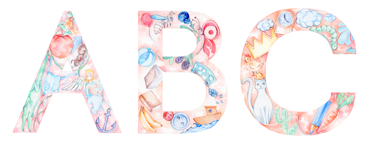
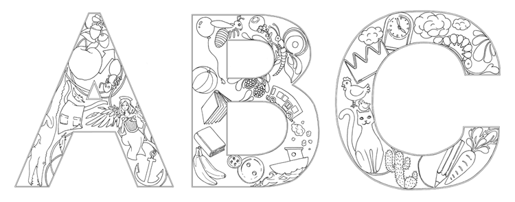
Also, you can now find some of my makeup illustrations in the form of stickers and prints in my Etsy Shop - I'll add more as time goes by.


11 August 2015

JULY FAVORITES : Writing, Listening, Drinking, Makeup

Where did July go? Where did August come from?

Evydraws Monthly Favorites Korean Makeup Evelyne Park Watercolor Illustration
... I admit, I know where July went. Everything was fine until mid-month. I was working on illustration projects, commissions, helped out at the Cafe, did some blogging, wrote my daily CampNaNoWriMo words for a story I'm working on.

And then my little brother came to Jeju. And another illustration project happened. And a deadline got moved up. And July kind of ran me over.

BUT. It may be August, but I'm still using the same stuff anyway because I'm just that boring!

On we go! Scroll down if you only care about the Korean makeup stuff and mini-reviews!

What is yWriter, you might ask.

Well, if you have heard of Scrivener, then it's a freeware version similar to that.

If you haven't heard of Scrivener, let me explain. I love writing stories. Which always end up as a chaotic collection of plotholes and dialogues about half-way through.

yWriter is a writing software with very helpful features for organization and structure! It allows the creation of chapters and scenes and counts words for each of those individually and cummulatively. It has sections for notes (which don't count to the total words!) and character summaries.  It's the perfect program to use when I'm writing a story/comic book script and need a place to just dump all the bits and pieces that I have so that I can move on.

I participated in CampNaNoWriMo and the word count functions were really useful for keeping track!

Also, I really like the minimalistic layout. And it's free. Yay!


I tried to scale back my coffee consumption the tiniest bit (iced coffee makes me loose track of numbers) and iced Ovomaltine was my alternative!
It's so delicious and surprisingly refreshing. Now I'll have to find an alternative to Ovomaltine in August as my stock is running low.....


Audiobooks keep me sane during long days and weeks of just drawing, drawing and drawing for >10 hours a day. As mentioned I had quite a lot of projects to finish in July, so my audiobook consumption rivaled my coffeine intake!
'Ancillary Justice' was by far the most interesting book of that month, though. The narrator is just so fascinating and confusing - and something I've never encountered in a book before. A 'machine' with numerous bodies and both individual and connected consciousnes telling a story? A machine that, to make the narration even more complex, can accurately read feelings/bodily functions in its human companions?

It's not an omniscient narrator, but a VERY VERY VERY well informed one. :)

The actual audiobook narrator was lovely, too, and I enjoyed every minute of the performance. (Also: SCIFI! BATTLESHIPS! AUGMENTED BODY PARTS! <3)

바람이 쌓은 백사장 #1 shade innisfree liquid glow shadow summer 2015 collection watercolor illustration
Jeju Color Picker Liquid Glow Shadow Illustration - featuring GLITTER

Now to the makeupy favorites.

As you've maybe noticed in my previous makeup/beauty related posts, I'm kind of an innisfree addict. This Korean brand just works so well for me! OTP. I could literally do swatches and reviews for every single product they have.

So it's no surprise that my two favorite makeup products for July were from Innisfree.

The first one is a liquid eyeshadow from their summer limited edition. The collection is called (kind of awkwardly) 'Jeju Color Picker' - they picked the colors based on locations on the island Jeju.

... where I live. I had no choice but to buy at least one product. Believe me. NO CHOICE.

I got the shade number 1 of these 'Glow Liquid Shadows', inspired by the white sand beach riiiight around the corner from my home. Yay. I don't even need to leave my house anymore.

Innisfree Jeju Color Picker Liquid Eye Shadow Packaging Korean Makeup Photography
The packaging of the Liquid Glow Shadows is so pretty,
showing the local diving women called 'Haenyeo'.
As for a mini review:

I used this a lot while on a little trip to the south of the island. No need for brushes, no need for other colors, no need for an eye primer. It's sparkly but there's no fallout and it survived long days outside without smudging. What more would I want?

To demonstrate how this eyeshadow looks without anything beneath, around or above it, here's two swatch pictures on my ol' eyes.

Bonus point: It's actually COOLING on the eyes, and I love the feeling!

eyeshadow swatch innisfree liquid glow shadow Jeju color picker collection 2015 shade #1 바람이 쌓은 백사장
One layer of smudged Innisfree Liquid Glow Shadow in shade #1

I'm kind of terrible with applying makeup, so I just dab one, two, three points of this on my lid and then spread it out with my finger. It's also possible to apply it in a more opaque layer without so much smearing involved but that would require ~*~precision~*~ I lack.  

An eye primer or base shadow would of course help to cover up those creepy veins all over my eyelid, so maybe I should reconsider my technique.

Innisfree Liquid Glow Shadow Jeju Color Picker Collection 2015 swatch 바람이 쌓은 백사장
I've got slightly hooded eyes so I love glittery eyeshadows to 'open' my eyes! :D

This is actually MY VERY FIRST TIME doing close-up shots of my face and it's terribly educating on both the state of my makeup skills and wrinkles.


.... moving on!


Makeup Watercolor Illustration Korean Brand Innisfree Lipstick Colorglow
Innisfree Colorglow Lipstick in #10 Daisy Coral - Watercolor Illustration
This is an old one! The Innisfree Colorglow Lipsticks were released back in 2013 and I've loved this lipstick shade ever since. It's bright and orange with a hint of coral and screams 'summer' very loudly - but at the same time it's wearable without much fuss and can be toned down nicely.

Korean makeup review innisfree colorglow lipstick #10 Daisy Coral
The packaging of the Colorglow lipsticks is really simple but sturdy.
No broken caps despite me tossing this one around in bags and letting it drop to the floor a LOT.

Korean Makeup Review Innisfree Colorglow Lipstick Product Photo #10 Daisy Coral
The lipstick bullet is easy to use~

As the name 'colorglow' suggests, it is quite shimmery and glowy! I find matte orange lipsticks hard to pull off so I love the texture of this one!

Korean Makeup Swatch Innisfree Colorglow Lipstick Daisy Coral #10 Liquid Glow Shadow  #1
That's how the Liquid Glow Shadow looks before blending. 

Swatches of both the Innisfree Colorglow Lipstick and the Liquid Glow Shadow. 

The lipstick swatch is just one layer, so I could definitely build it up!

Korean Makeup Swatch Innisfree Colorglow Lipstick Daisy Coral #10 Liquid Glow Shadow  #1
...and after blending furiously.

I also received a freeby with my Color Picker purchase because the sales lady was just that nice! (I didn't quite meet the minimum amount of money spent for the event, but hah!)

Korean Makeup Review Innisfree Colorglow Lipstick in Daisy Coral Jeju Color Picker Collection 2015 Hair Ties Liquid Glow Shadow #1
My July favorites plus the free hair ties~

Now I've got three more hair ties I can lose somewhere! Though these are really cute and I'll cry when it happens.

Korean Cosmetics Freebies Event Innisfree
The little pendants are adorable, really.


That's it for the month of July!

As mentioned, this was my first time doing some ~real~ beauty blogging stuff, as in taking pictures of my actual face and swatches. THIS IS SO HARD TO DO. Respect to all those beauty bloggers with gorgeous blog photography and magical makeup skills!

But I love combining my drawings with pictures and mini-reviews and will continue like this in the future! August, here I come!

9 August 2015

ILLUSTRATION PROJECT - Illustrations for a Children's Picture Book!

I'd like to introduce a new 'Illustration Project'! (Wow, it's been a while...)


Over the last two months I've worked with the author Nicola Gothard on illustrating her children's picture book story 'The Rubbish Dump Whale'.
The story focuses on animals living in one of the - very real - garbage patches which are present in every ocean on this planet. It shows the struggle of three animals trying to change their oceans for the better and even teaches some lessons on how to minimize ocean pollution at the end of the book.

It is also incredibly cute. ;)

So, in this 'Illustration Project' blog post, I'll show you some of the final illustrations as well as sketches and different stages of the drawings. Let's call this a 'Making Of' post.

If you like what you see, you can order the book on amazon. There's both an ebook and a print version (print version link coming soon!).

More information can be found on the generation2050project website, too!


Now, on to the actual illustrations!

I did some character sketches first.


As the story takes place under water, watercolors were the perfect match. The textures created in watercolor would give a playful water effect fitting a children's picture book.

Then we started with sketches based on the pre-written story.


My sketches are ridiculously bad. I'm still surprised the author could actually guess what the finished illustrations would look like. 

After having all 20+ pages approved, I started working on detailed pencil drawings.

Some of those were kept rather simple to leave space for text and to focus on the animals themselves...


On other pages we wanted to really put the focus on the actual pollution, so the pieces of rubbish had to be very detailed and 'swallow' the whale swimming among them.


These pencil drawings were then colored in.

I used a kneadable eraser to make the pencil lines less prominent and combined that with a small eraser to keep the lines crisp and precise.

No, I didn't use the Micron pens, of course. 
The eraser pen on top was used, as well as the brushes. 

I kind of always use the same materials. I'm boring (and stingy) like that.

As for the watercolors themselves, you can have a look at my watercolor swatches and review fest here

First interior illustration of the book, introducing the whale and his 'home'.

Some of the watercolor blotches (?) were created seperately and then layered on top of the illustrations in Photoshop. This made for more vibrant color effects and for more flexibility when it came to layouting, as I was able to move parts of each illustration around independently.
Water bubble effects - I made like ten sheets of these.
 (If anyone's interested, I could offer some of these as Photoshop patterns or brushes.)

Definite improvement over the initital sketch. I hope.

You can have a look at the illustrations on my portfolio site, too!


For some of the illustrations I added text effects. Like the water bubbles I drew all letters on a seperate page and arranged them in Photoshop.

Love to hate the derpy expression in this sketch. 

From sketch...


... to drawing ...

... to finished illustration.


Like I'd mentioned, there were also some tips and reminders on reducing pollution at the end of the book, which we presented in the form of letters from the animals to humans. This also required some additional illustrations to make the texts more visually appealing.


All in all I really like the result and I'm looking forward to holding a printed version in my hands! (it's on its way, but well, Korea and the UK aren't exactly next-door neighbours.) I'll force the book on my little nephew who's already studying English in Kindergarden...

Ocean pollution is a major problem, but also an often overlooked one. I'm happy to have contributed some small illustrations to, hopefully, raise awareness. And I'd be even happier if you could share this post or the book so it can reach a wider audience!

Thank you!