30 June 2015

Daily Drawings: Baking and Korean Dramas as a Way to Practice Korean

Some very quick daily sketches/diary entries as the last weeks were hell.

The monsoon season has begun here in Korea, and I thought that the constant rain would make for some quiet days in our Bistro... nope. People like to escape the drizzle even more than they like to escape the sun, so I spent most of my time working and nearly none drawing. 

I did feel a sudden urge to study some new Korean vocabulary, however! So I went ahead and watched an episode of a new Drama on television (called 'High Society' in English), pausing every once in a while to look up vocabulary and spelling. 
A lot of foreigners I've met here in Korea say that watching Korean dramas helped them studying. I've never been good at remembering vocabulary I only hear once, so I thought that making these notes would help me put all the new words in context. 

It was surprisingly fun and effective! I remember all of the words - as I can remember them in the context of a certain scene it's less boring a task to commit them to memory. And because this drama features a nice mix of work and family life, I was able to catch up on both Banmal (informal speech) and Jondaemal (formal speech). Will continue with the next episode!


I also had one major baking day. I love making my own bread since moving to Korea! Recently I've also gotten into making pizza and pies, and I combine all those tasks into one glorious kitchen-destroying baking day every week. Once I get into the flow of things, I can't stop.......


28 June 2015

My Watercolor Collection: Swatches and Reviews of Winsor & Newton, Talens and Schminke Colors for Scientific Illustration and Manga

Watch me geeking out over little pots of paint.


I really wanted to do this post for a while - it's one of the very reasons I started this blog, actually! I'VE GOT SO MANY THINGS TO SAY ABOUT WATERCOLOR.

Watercolors are my favorite medium. I might prefere pigmented inks for manga illustrations as they are more vibrant, or use colored pencils for realistic shadings, but I'll always come back to watercolors. Often, I mix them with other media, especially with my Dr.Ph.Martin's pigment inks, as they can be kind of overwhelming on their own and clash with each other if I'm not careful. Watercolors are more muted and can make for a more harmonious look.

So, I don't want this to be JUST a long loveletter to watercolors but an actual swatch collections and short review. If you're looking to buy a watercolor set (invest in your future, now!), maybe this can help you in choosing your first colors. Or, if you're already an avid user, you can find some new brands or special colors to add to your collection.


That's my good old case full of colours. It's quite old, as I 'inherited' it from my grandmother (she's alive and well, but she stopped painting some years ago and gave it to me as a gift when I started going to art school) and some of the colors have suffered with time.
All the large pots are from her original case and well over 15 years old.
The small pots are my own additions, bought over the last 7 years (what? where did the time go??) for special colour needs.

The original case is from Talens/Rembrandt and the original colors are from Winsor and Newton. Most of my additional buys are from the same brand for the sake of boredom, though some are from Talens/Rembrandt and Schmincke, as you can see below.

The little blops (?) of color on the right are from art school, where we got to use some tube watercolors - I just added some to my case to save for later. I'm cheap like that. Though a lot of the color blops are from that one time I left the case in the hot Korean summer sun and my colors melted into rainbow sauce.


So many pretty colorssss! Preciousss!
On to swatches!


napel yellow napel red talens rembrandt watercolours aquarelle

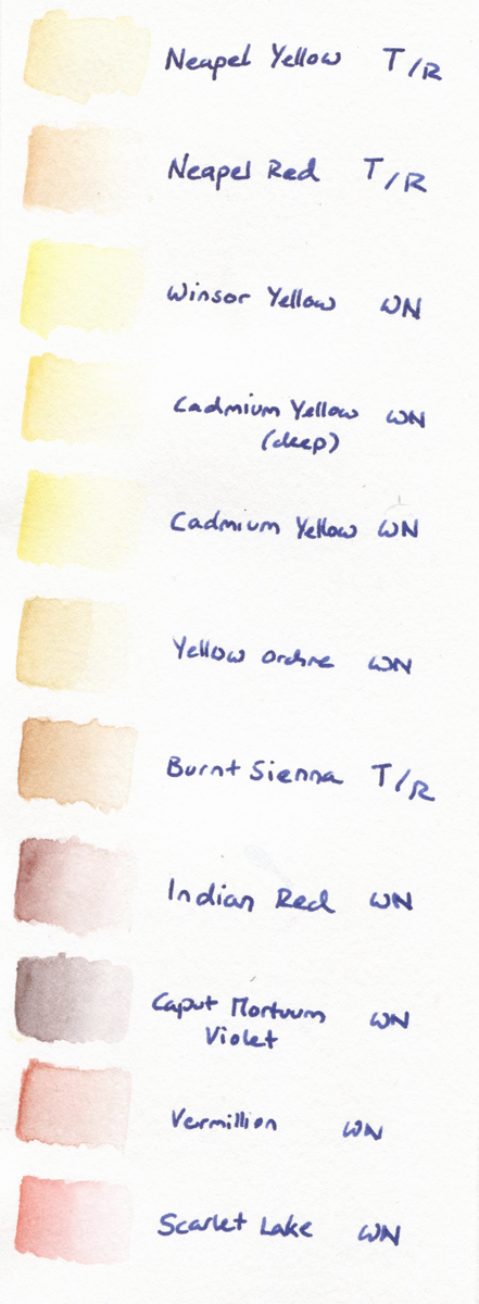
Napel Yellow and Napel Red from Talens were bought when I got started with manga illustrations in watercolor and noticed that Yellow Orchre made for some strange complexions. I mix those two for skin tones, getting warm-yellowish undertones or pinkish undertones depending on the characters. Since I've started using pigmented inks I prefer those for skin colors, though, as the watercolors give a duller result. Now, I use them mostly for skin color shadows and realistic portraits. They are quite hard to build up, as in they don't get much more saturated by layering or using more color-per-drop-of-water.

winsor newton watercolour aquarelle

I didn't like the original Cadmium Yellow in the case, as it gave a bit of a too glaring egg yolk color on paper. So I added the Winsor Yellow and Deep Cadmium Yellow to mix it up. Winsor Yellow mixed with Napel Yellow makes for a really nice blond haircolor base, and the Deep Cadmium Yellow has a warm tone that's more harmonious with other hues than the normal Cadmium Yellow.

As mentioned before, Yellow Orchre was my very first 'skin tone' color. I still use it as a mixing color if I want to make another color 'dirtier'. But since I've bought Burnt Sienna by Talens, Yellow Orchre has kind of just been sitting in my case...


winsor newton talens watercolour aquarelle

Burnt Sienna is a VERY versatile color. It's color payoff is fabulous (especially compared to the two Napel colors by the same brand, which are hard to get saturated) and the hue is really gorgeous. I use it for skin tone shadows, for hair colors, to warm up and soften other colors by mixing it practically everywhere, and it's also beautiful on its own. If you want to buy just one color by Talens, go with this one! It's an all-rounder.

Indian Red is similar in that it's also an all-rounder that can be mixed well with other colors to give them a reddish hue, and it's easy to saturate. Very useful for nature backgrounds and hair colors, and I really like the effect it gives for skin color shadings (I use it around the eyes of light-skinned characters to give them more depth).

Caput is a strange color. I bought it on a whim because I'd never heard of that shade and it looked reddish-brown but was called Violet. Intrigued!
It's exactly that: A dark brown hue with cool violet undertones. It's actually a nice shading color for brown tones or to mix with blues for a darker, warmer tint, but most of the time I kind of forget I've got this in my case!

winsor newton watercolour aquarelle

Vermillon was there from the beginning, and I really dislike this shade of red. A bit glaring, but not bright, not very easy to layer (it gets duller instead of brighter) and the shade is just not a red fitting my taste. (color snob right here)

Scarlet Lake to the rescue! I bought this pot over my Vermillon frustration, and it's all I wanted. It can go from very light to very bright with just one layer, it's very pigmented, has a cool undertone without going all pinkish on me, and mixes well.

winsor newton talens watercolour aquarelle

Quinacridone Magenta (a name that just flows of the tongue...), also one of the original colors, is what Vermillon isn't: It's pigmented and easy to layer. Pink is just a color I don't use all that often, so it looks good as new.

Years ago I'd invented a manga character with violet hair, so that's why there's two shades of violet added to the case. I was too lazy to mix, and despite not using them for hair (often...) anymore, I still like these for cool-toned shadows that aren't all-out blue. They may look similar, but as you can see one has cool undertones, one warm undertones, and their pigmentation is also slightly different as they are from different brands. The Mauve shade by Schmincke is smoother, while the Talens' one can get very dark very quickly.

winsor newton watercolour swatches aquarelle

Then there's the quest for the perfect shade of blue. I love blue, it's my favorite color and all, but I'm still not all that happy with the shades I've got here.
Manganese is a very light blue with a mint-undertone that goes well in nearly all color compositions, but it's not very pigmented and you need to use a lot of it to get nice payoff.

The Cobalt Blue is more pigmented and the shade very 'standart', but it's also not very bright. It almost looks a little milky on paper - as if someone had mixed it with white guache. That can work for some illustrations, or look dull in others.

The original blue tones from the case were Ultramarine and Indigo. Ultramarine is the one I use most frequently. It has nice payoff, a flattering shade and mixes well with other colors. It also doesn't have that milky effect and is brighter than Cobalt Blue. But I'd still wish it was even more saturated, more eye-catching! It's just not that beautiful on its own...

Indigo is VERY pigmented. As in, I use one drop of water, let it fall on the color, DON'T STIR and just use the color that comes with the water on its own. The high pigmentation makes it easy to go very dark and saturated and it's a nice color to work with quickly. But it's difficult to get even color payoff as it is so pigmented, and it can look blotchy if you don't mix very well.

winsor newton aquarelle swatches watercolour

I've got a lot of green hues - my grandmother loved painting landscapes, and I was a science illustration student using watercolors for botanical illustrations, so here we are. I adore mint, too, so I've added Cobalt Green and Cobalt Turquoise Light to the collection. They are beautiful shades, but have similar problems like their blue counterparts. Cobalt Green, like Cobalt Blue, has this milky effect that makes it hard to have a bright color for a result. Turquoise Light, similar to Manganese, is not very pigmented and needs to be used with force to get a bright result.

The shade I use most in manga illustrations is Viridian. It's such a nice shade, not a jewel-tone but bright, saturated and with a cool undertone. As it's easier to make a cool color warmer (mixing it with Sienna for example) than to cool down a warm color, I prefer my basics on the cooler spectrum.

Terre Verte Yellow Shade was an impulse buy. It works well for landscapes and botanical illustrations that need to be toned down, but it's all the same a color I don't use that often.

Permanent Sap Green and the Chromium Oxide were the original colors. Permanent Sap Green has a very nice pigmentation - a little goes a long way and it's bright! (almost too bright to be used in botanical illustration, but very effective in my manga illustrations).
Chromium is less saturated and gives a duller result, but it's the color I use more often, actually, as it makes for a beautiful mixer with blue colors!


My darkest shades:

Burnt Umber is a good, basic brown for landscapes, though it isn't the best mixer - I prefer using the Indian Red and Burnt Sienna if I want to darken and 'warm up' other colors, as Umber has a tendency to turn everything into dirt soup.
Also, I have to think of Lord Umber whenever I'm using it, so sadness ensues.

Payne's Gray is my go-to shading color. It gives a very constant color payoff, not too pigmented or milky, so it's easy to work with and mixes well with anything.

Neutral Tint is a tad more tricky, as it has little pigment pieces in the actual pot that act up when mixing, making little spots darker or lighter on a whim. It's not really that noticable, and I actually prefer the hue of this one over Payne's Gray, but if you're mixing, you've gotta be careful if you want a nice gradation.

I DON'T OWN BLACK. I didn't know. My life makes no sense.


That's it! I'll never talk about watercolor shades again. Except if you ask me...
Do you work with watercolors? Do you have a shade or brand to recommend? DO YOU OWN THE PERFECT BLUE?

If you're interested, here's how I work with watercolors for animal illustrations.

And here's how I used these to create a botanical illustration.

25 June 2015

Illustration Step by Step: Preparing the pencil sketch for coloring with watercolors

Hello! I've recently finished this illustration:


It's been my first try at a watercolour manga illustration without the typical ink/pen/digital outlines, and I've documented my process to look back on it in the future and laugh at how serious I took this. Yes.

Whenever I try something new, I'm all about trying my very best - because if it doesn't go well, I'll know that maybe it just isn't a way that works for me, not because I was sloppy.

This was the initital sketch (left) and the transferred drawing.


I transferred the sketch onto a new sheet of paper using my light table and a soft pencil, because using anything harder than 2B makes it impossible to see my own lines against the backlight provided by the light table.

Using a soft pencil meant that the resulting drawing was quite heavily outlined despite the lack of pen or ink lines. So before moving on to colours, I 'redrew' the lines. First, I reduced their visibility with a kneadable eraser, dabbing away any excess of graphite and dust. This also smudges the drawing a little, so I went in with a hard (H) pencil to add definition and details to improve on the inital sketch.

The result were detailed, sharp lines that were at the same time barely visible. Using a kneadable eraser instead of a normal, hard one also makes damage to the paper less likely, so I was left with an ideal starting point for adding watercolours.

I've made a speed drawing video of this process, as it's kind of hard to explain in words without sounding over the top, haha...


Next part will be focusing on colours!

Material used for the pencil drawing:

- Printing paper (80g) for the first sketch
- 0.5 pencil (2B) for sketching
- Light table ComicMaster Tracer LED-A4
- Fabriano Watercolour/Acquarello in Artistico, Extra White/Hot Pressed, 300g/m2
- 0.3 pencil in 2B
- Pencil in H 
- Kneadable eraser 


23 June 2015

Daily Drawings and Talk To Me In Korean Language Practice

Daily Drawings, next portion!


It was kind of ironic how the very first weekend after I'd started both a blog and a youtube channel, our wifi decided to peace out. All that motivation went into a vacuum of internet silence. 

Well, I used the time to work, since weekends are the most busy part of the week if one works in a Cafe/Restaurant. And filled all my free time with drawing and gardening. 

Little illustration for Talk To Me In Korean's 'Describe this Picture' series.

I also took some time to look at new Korean language lessons on the site Talk To Me In Korean.
Since moving to Korea nearly two years ago, I've studied a lot on that site. As I live on the countryside and had a busy schedule, I couldn't attend language classes except free classes at the immigration center (which were fun but kind of haphazardly organised and really, really far away from our home...), so Talk To Me In Korean was a wonderful source for my self studying efforts. Korean is a hard language to get into, especially at first, so I listened to some of their grammar lessons so many times I can practically recite them by heart!

Recently, I'm focusing more on vocabulary, as my Korean grammar is suffiscient to get through the week without having people look at me like I'm speaking in tongues. But I really like their 'Describe This Picture' lessons series, as they're short and fun, combining old words for repetition with some new ones. This lesson was called Pink Umbrella and I found the picture funny, so I went ahead and drew it, then attached the sample sentences from 1 to 5, as well as some grammar and vocabulary notes. I'll continue to do some Korean Language Sketches, as I'm kind of tired and bored of self studying at the moment and need to spice things up!   


22 June 2015

Daily Drawings, Jeju Landscape Sketch and Meet the Artist tag (#meettheartist)

Have you heard of 'Hobonichi'?

The 'Original Sized Garden Findings' were a dead spider,
but I was too scared to actually draw the entire body, so there's only a leg and head.
No, seriously, something that looks like a small, shriveled-up Tarantula
should NOT be in my garden. Or anywhere else, actually.

I've recently stumbled upon that illustrated diary trend by falling into the rabbit hole that's artist videos on Youtube. The idea of summarizing one's days by drawing simple (I repeat: simple) illustrations into a diary/planner really appealed to me. And as I'm a person that has to try out anything and everything I find intriguing, I started doing some daily sketches. 

Hobonichi Daily Diary Drawing
Near my village, Sehwa-ri, with the (very much dead) volcano Hallasan in the background.

I don't have any sort of fancy planner, Hobonichi or similar. I'm just using a simple empty sketchbook I had lying around. My general idea is to sketch daily, be it events of the day in diary fashion, landscapes, little comic sequences illustrating the past or something completely different like the Meet The Artist Tag. The point is to draw and write daily without it always having to relate to work or some long-term project. Just little sketches.
#MeetTheArtist
I really look exactly like that in reality. 

I've got quite a lot of these already done, as I started nearly ten days ago. Will upload them in groups of three to four until I'm caught up for actual daily postings!
  

19 June 2015

ILLUSTRATION PROJECT: DANCING ANIMAL WATERCOLOR DRAWINGS

For this illustration project, like the previous flower bouquet illustration, I got commissioned to do watercolour paintings. As watercolours are my favorite media, I was more than happy to work on this little series of dancing animals!

The giraffe's pattern nearly killed me...
The animals were specified and were supposed to be posing and dancing. The wished for style was slightly cartoonish, but still realistic. So I went with simplified forms, but had the animals generally keep their natural anatomy and movements.
I'll show you my process for this series, as I took some photos despite the thight schedule. 

Materials used:

~ Printing Paper for rough sketches
~ Lead pencil by Pentel in 0.3 as well as 0.5
~ Pencil leads were mostly soft B and 2B to give enough contrast.
~ Fabriano Academia Drawing Paper in A4. Not specifically designed to work with watercolours, but as long as one doesn't drown the paper in water, it holds up very well and the minimal texture makes for high-quality scans. 
~ Watercolours by a variety of brands (I mix and match, will upload an overview of my colours soon!) like Schmincke, Talens and Winsor&Newton.
~ Kneadable eraser by Faber Castell.
~ Normal eraser by MONO.
~ Watercolour/Ink brushes by some no-name brand.
~ Da Vinci Forte Synthetics Watercolour Brush in 3/0 (also known as 'ridiculously tiny')

Sketches of all animals in pencil. Giraffe getting preferential treatment.


First, I did some rough sketches in pencil. 
The goal was to get the individual poses of each animal (front and back) to look varied when put next to all the others. Especially the tiger, lion and leopard had to be posing very distinctively so they wouldn't get repetitive.

If you ever feel down, try drawing a dancing turtle.


Dancing Turtles, saving the day.
After approval was given, I went over the sketches, erasing rough lines with a kneaded eraser and defining the forms with a soft lead pencil (0.3 mm, 2B).
The end result is a tad messy, still looking like sketch, though a very detailed one. Ideal for capturing movement and dynamic poses.


A first wash of colour, mostly gray and sepia, was used to define the larger forms, shadows and fur patterns of the animals.


Detailed colors were added in layers, leaving the images to dry in the meantimes.


I took care to keep some sharp edges, as watercolors have a tendency to look "washed out". All the animals have a similar base color, namely Sepia mixed with Gray and Sienna. So even though some of the animals like the flamingo have quite eye-catching colors as a last layer, they fit into the series as a whole.


Before moving on to scanning, I went in with my trusted lead pencil once more to redefine some of the lines (especially in the faces) that had gotten washed away by the colour layers.

The pencil came also in handy for adding some details to the fur patterns.

After scanning (I use an Epson V330 Photo Scanner, which gives a nice colour payoff) I had to bring out the whites for the background, which I mostly did by just masking the animals entirely. With selective colour correction and added vibrance/saturation in Photoshop, the colours were resurrected. As you can see below, this step makes quite the difference!

Just after scanning...
....and after masking the background, increasing vibrancy, saturation and contrast in Photoshop.
To finish the commission, I also created a group picture of all animals, which you can see in my illustration gallery.
For personal use, I went over the dancing tiger once again in photoshop, adding additional watercolour elements created seperately (the leaves) as well as creating colour layers on multiply/overlay to make the tiger as a whole more colourful. The final design will be used for printing.

Dancing Tiger Illustratio
Also, as I just find them really adorable, I did the same for the turtles. 
Shake it~

16 June 2015

ILLUSTRATION PROJECT: WATERCOLOR FLOWER BOUQUET, BOTANICAL DRAWING STEP BY STEP

This will be a series of blog posts under the name of "Illustration Project".

As I work as a freelance illustrator, I thought it would be a good way to inform you on what I do, how I work on specific projects and what materials I use.

The first one I want to introduce was a wedding invitation card illustration. The couple wished for a very specific arrangement of flowers, with a total of twelve different kinds of plants to be featured. All flowers are representative of different countries, which I found a really neat idea! (Though it did make the composition quite challenging...)
These were the flowers in question. To get an understanding of each specimen, I started with some rough studies in pencil. These sketches were based on various reference images and were meant to help me learn how to draw each one of them from imagination for the actual bouquet illustration.


...possibly I kind of went overboard with these, but yeah. The next step was finding an arrangement for the flower bouquet itself. I worked on first sketching out simple geometric forms (here the previous studies came in handy, as I had a sufficient understanding of the dimensions of each flower to mash them all together without further photographic references) then added details once I had the general composition sketched out to my liking.

When drawing a bouquet, or flowers in general, it really helps to remember that they are geometrical objects. Their petals are arranged in a certain way, they have varied textures and thickness, are in some cases resilient, in some cases 'just hanging' downwards. Many how to draw flowers instructions focus on the colors and patterns, but when going for realistic drawings as in botanical illustrations, it's important to approach flower like anything else one would draw: An object in space, with height, width and depth.


The brown tint was added in Photoshop for better visibility, as the real sketch is a more smudgy pencil mess. After approval by the client, I went on to trace the drawing with my light table. Using a very hard (4H) pencil with as little pressure as possible, I recreated the sketch on watercolour paper. As these lines were eye-hurtingly light I could barely see them, much less take a picture of them, we'll have to skip that step. 

On the new sheet of paper with the nearly-invisible pencil drawing, I then added some first layers of colour. Mostly cool-toned greens, blueish and grayish shadows and hints of scarlett for the flowers. Hints of colour, I repeat, HINTS. My four year old nephew was visiting at the time and he felt a great need to help me paint as I didn't seem to progress at all. I declined his help and kept on layering shades of colour all over the flower bouquet to get a general idea about the lighting and forms involved.

At this point, it helps to ignore the pencil outlines of the individual flower drawings and focus more on the overall shadows and lights.


Some real colours happening! This may seem excessively slow, but while working fast with watercolours works really well for certain styles of illustrations, the hyper-realistic colours and details in botanical illustration are much easier to achieve if one takes it one baby-step at a time. It's easy to ruin an illustration by being impatient, so I took my time while listening to an audiobook...


...or two. Maybe three. Good times.

While adding the 'real' colours (as opposed to just shadows) I focused primarly on the cooler tones in the beginning. Even colours like red have warmer (orange) and cooler (pink) varieties, and while it is possible to make any existing colour on an illustration warmer, it's much more difficult to make it colder afterwards. The warm hues will always shine through, no matter how much blue-ish shades one layers on top. 

As visible in the image above, I was focusing on the big show-stealing flowers in the center first. I had to get them right or the whole illustration would seem off, as they would be what catches the eyes in the end. I did continue to layer greens and blues for shadows all over the bouquet, though, to profit from the drying intervals.

Don't forget that not only the individual flowers, but the bouquet as a whole is an object in space! So all the usual rules of painting perspective apply: The flowers and leaves in the foreground of the illustration have sharper edges, those farther at the back soft edges. Warm colors dominate the foreground, while the background is more cool-toned even at the end. This helps to trick the eye into seeing the flower bouquet illustration three-dimensionally.


When I came to this point, I knew (finally!) that I was on the right track. I had colours more or less everywhere, some focus points in red and blue, the acacia and gold rain to break up the overall composition so it wouldn't look to strict, and lots of white flowers to contrast with the shadows. 

In botanical illustration, most work doesn't lay in the details the viewer sees immediately (like filligrane leave patterns or flower petals) but in getting the basic structure and colours correct in the beginning stages. So, from that point on, changes get more difficult and one can just hold on thight, keep on layering and hope for the best! (and keep some white guache on hand for rescue missions!)

After some more time (we're talking hours, not minutes, if you weren't sure) I got to scan the illustration in 600 dpi. There was lots of tweaking in photoshop involved, as most of the nuances got lost during the digitalization, and the client had wished for some really high-saturation, colourful "slightly kitschy" variations. 

(Also, the illustration is made on A3, while my scanner can only go up to A4, which meant some doctering to combine the two halves of the illustration after scanning.)

One of the finished digital versions. 

To optimize the illustration for printing, I went in with my graphic tablet and did some overpaint-layers (set on multiply, normal, soft light and other settings according to colours) to bring together some of the elements that fell apart due to scanning. 

I - and more importantly my client - was very happy with the result and the illustration will now function as invitation card and for other decorative purposes at the client's wedding. 

Hope this gave you some insight into a veryyyy sloooow botanical illustration process. Take your time, prepare well and have a good audiobook on hand!

10 June 2015

Manga Postcard Illustration Process: Chinese Zodiac as Manga Characters

Here we go! I'll give you some insight in how I draw.

I've recently started creating quite a lot of postcard drawings. I myself love collecting (and sending and gifting...) postcards, so discovering that the format isn't popular in Korea and hardly ever finding a place that sells some, I took matters in my own hands. (Seriously, why are there no postcards here? Not even touristy ones? I only ever find prints in art museums.)


I use watercolours on the Fabriano Watercolour postcard paper.

As the Fabriano Watercolour postcard set has a rough finish, it's quite the challenge to get the 'clean' look I normally prefer for my manga style illustrations. For these Fabriano cards, I focus more on textures than on detailed lines. If you like to use a wet-on-wet technique, this paper should be right up your alley. The 250 g/m2 make it sturdy so it doesn't self-destruct when one uses too much water.

Draw some postcards~


For the lines, I've recently fallen in love with the Micron Multiliners. They are softer (and cheaper!) than a lot of the other brands out there and the sepia tone has a really nice hue.

Small and smaller brushes among the materials I've used...

My good old messy watercolor collection.

My watercolors consist of a wild mix of different brands, mostly rembrandt and winsor&newton, but there are some stray Schmincke and some no-name brands to be found as well. I highly recommend the winsor&newton watercolors and will give a more detailed review in the future!

This postcard is actually the second in a series of motives focusing on the Chinese Zodiac. The idea came to me when the Korean New Year festivities came around and the year of the sheep started. Inspired, I drew a simple sheep postcard for that zodiac sign. Now I'm getting to work on the other zodiac animals, and as there are twelfe in total, there will be many more of these to come.
Year of the Sheep Watercolor Postcard


I want to keep the animal references subdued and focus more on the general atmosphere to be fitting to each zodiac animal. The horse called for a wavy mane of hair, movement and bright colours.

You can have a look at the entire drawing process - from pencil sketch corrections to multiliner inking to colouring - in my first-ever speed-drawing video. I had lots of fun filming this and way less fun editing, as my camera crashed multiple times and I was left with a patchwork of video sequences all with different lighting and perspectives. But well, everyone has to start somewhere.


Thanks to this video, I've noticed how much I move around when I draw on small paper formats (the Fabriano postcards measure 150 by 104 mm). I do this to find the ideal angle for my brush, but maybe I should try to keep that in check for the next video. It looks quite frantic...

It can only get better from here on out!

You can buy the original card in my new online shop.


Follow my blog with Bloglovin